

A Tale of Two Cities
A Data Dive into Inequality of Opportunity in the Atlanta Metro

Recently, I encountered a MIT Master’s thesis written by a Boston-based urban studies professional, Collyn Chan, which sent me deep down a rabbit hole. I am fascinated by America’s urban divides, so I naturally latched onto the notion of communities of concern she applied in her thesis analysis of NYC managed retreat from flood zones. Her thesis emphasizes that what we often pigeonhole into the climate bucket has a way of leaking out into distributive justice, and that we ought to at least to attempt to combine the two in a unifying vision. For more on the notion that the climate abyss will not be an alien experience but an uncannily familiar heightening of our current dystopia, I highly recommend climate journalist David Robert’s conversation with Adam McKay on his new Netflix movie, Don’t Look Up. Roberts once joked with me on Twitter that killing optimism was his raison d'etre, which came out in the conversation in spite of the positive reception the movie has received from a mass audience.
A Random Walk through Atlanta as a Window into U.S. Housing Segregation
When Chan noted that she borrowed her community of concern methodology from a R markdown of a SF transit study, I developed an itch, wondering what some of the statistics I have been observing for the last few years would look like in a city of interest, Atlanta. The reason why I chose Atlanta will become clear in a minute. But the basic observation is that, like many other cities in the South, there is a very clear black-white color line in the city. No doubt a cruel irony to those who attempted to escape the terror of the Jim Crow South, this intense hatred and segregation followed them during the Great Migration, made clear by a HBO documentary I watched on MLK day this year. I knew a professor at UCSD who researched mass incarceration that always insisted to students that there is no such thing as southern, everything south of the Canadian border is “southern” when he explained this history.
When I lived in Atlanta, I resided in an old but trendy neighborhood called the Little Five Points near the city center. Whenever I would go on a morning run, I always couldn’t help but notice that the impression you got of the city was radically different depending on the course of the run. If I ran north through Druid Hills toward Emory University, I would gawk at the stately estates built for the city’s thriving magnates of the Fordist era. If on the other hand, I ran south into Edgewood, I knew from my surroundings that I had stumbled into a historically African-American neighborhood. Why was it predominately African-American, I asked? Historically, a chemical plant was nearby. A reminder that environmental racism is nothing new. The potential displacement of climate change adds a new dimension. Displacement will occur, the choice is will it be planned or take the two other related forms of disorder, market-driven retreat (can’t argue with your insurer) or traumatized disaster (can’t negotiate with a storm).
The historical questions I had about the way the city I encountered looked the way it did prompted me to examine the New Deal era redlining documents. The clarifying comments truly are a marvel. The wealthy Druid Hills neighborhood was not granted with a A rating, because the HOLC warned of “infiltration” of Jewish families. The anti-Semitism of the era was covered well in the movie, Driving Ms. Daisy, who resided in Druid Hills and her local grocer was the Piggly Wiggly directly across from my apartment (now a Rag-o-Rama).

If you don’t ever sit down and take the time to read through archival documents, you can never appreciate just how alien and offensive the past is to current sensibilities. The anxiety of infiltration from what was regarded as unpure racial stock, chiefly Jews and blacks, shocks the unexpecting reader. Unless there existed some kind of barrier like a major thoroughfare or rolling hill, the HOLC risk assessors advised that folks who acquired property in any area near blacks should sell immediately so as to avoid the inevitable decline of their investment as the Others encroached on their neighborhood. This anxiety is what drove them to move to what was then the outer ring of the city in Tuxedo Park, which contains estates that are even more impressive than the ones that are found in Druid Hills. To this day, the affluent core of Atlanta is in neighboring Buckhead.
It may be tempting to believe that these prejudices have been banished to the ash bin of history until you read any newspaper headline anywhere in the country on opposition to low-income housing in moderately affluent suburban areas. The anxiety persists, driving many to isolated fringes on exurban rings. A real change is that folks are no longer comfortable blatantly characterizing integration as infiltration. A clip from an excellent PBS Frontline documentary on housing is representative of this limited change in attitudes (starts 11:30):
If you watch beyond this awkward interview, you will discover some very admirable journalistic grunt work into shell corporations of property developers and the way they turn affordable housing projects into unregulated slush funds. In the 1930’s, too, you will find that investors were constantly searching for opportunities to profit off the other half. One assessor who zoned an area near Grant Park as hazardous, nonetheless issued a revealing clarifying comment, “(a) This [hazardous rating] applies to white property, there is some slight demand for negro property on investment basis. (b) On white property, poor; on negro property, good.” Translation: these are the gainfully employed Negros who don’t earn much (estimated around $400-900 annually) but will still provide you with a steady stream of rental income without the expense of upkeep, if you choose to enter that business.
Poverty and Profit in the American City
That note serves as a natural transition to MacArthur genius grant awardee and Princeton sociologist, Matthew Desmond’s housing instability thesis. He finds that housing instability is off the charts compared to our peer countries, perhaps the greatest moral stain on the tragically unrealized promise of opportunity. Given that it is so dysfunctional and reproduces poverty, why does it persist? The conclusion of his book tackles the 900 pound elephant that haunts the American idea1 head-on. Exploitation is profitable.
In line with the housing theory of everything, I believe the connection between housing instability and the waning of American opportunity, a dream deferred, is often left unexplored. This omission is strange as it is readily apparent to anybody familiar with the stories from struggling renters Desmond writes of in his book.
Clearly, clusters of concentrated disadvantage are never good for opportunity, but the debt relations they engender may be plenty profitable for a decisive plurality to muddle along. That muddling is perhaps the most salient example of the engineering tendency I noted in a previous entry, the normalization of deviance. The deviance here is from a truly democratic conception of self-government, powerfully argued by the wonderful labor activist, Thomas Geoghegan’s book, The History of Democracy has Yet to be Written:
Let’s get real. Look at who the nonvoters really are…It was nothing personal; most sit out every election…people who are deeply in debt…That’s why we should see it as a kind of learned helplessness….It is a status inflicted on them—a kind of low-status civic servitude or bondage.
I suspect Geoghegan’s intuitions are strong, and likely inculcated by his engagement with another city with deep divisions, Chicago. For similar reasons, empirically grounded research emphasizes the role played by residential property managers, such as this study of Lexington, Kentucky. I was slightly less formal in teasing out the connection, but I reached a similar conclusion in my post on voter turnout in my hometown of Sacramento. Recall that I distinguished between low vote clusters along the north-south axis which appear to compound in vicious cycles of disadvantage and disengagement and the high vote clusters along the river, which see the opposite dynamics.

Without realizing it, my freehand drawing with the red and green pen in the GIS application was a process of distinguishing communities of concern with other neighborhoods. I discovered from Chan’s thesis mentioned in the introduction that there are more systemic methodologies to accomplish this objective. The Metro Transportation Commission of the Bay Area has a handy little chart and R markdown to enable people like me with poor coding skills to improvise a way to get data. I used their Community of Concern (CoC) thresholds for the Bay Area counties in my analysis of Atlanta because, while the high-higher-highest classification do not match the specified 0.5-1.0-1.5 S.D., the highest classification has the advantage of not exceeding the 100% limit for minority share.
Here is the first map of communities of concern mapped against the validated 2011 eviction rates2 for Fulton and DeKalb counties. The color outlines indicate concern level and shading indicate eviction rates split into three equal categories:

A couple things to note here. First, the fact that Cobb county has no eviction data makes it easy to see that, while there are some high communities of concern where minorities reside in Marietta, the overwhelming majority of tracts rated at the highest concern spring from the “hazardous” section in Southwest Fulton county according to the 1938 redlining map. Another legacy is that the very high eviction rates above 11.7 percent are almost without exception below the north-south line that divided the affluent white section of the city from where blacks were allowed to reside. Other scholars and civil servants have noted that there is an eerie tendency for eviction and redlining maps to almost perfectly coincide.
Average eviction rates in each type of community increase according to assessed level of concern, based on the eight demographic factors identified in the MTC methodology.

The overlap that is less well-examined is the overlap with opportunity rates defined as the percentage of a cohort of children growing up in the bottom quintile of the national income distribution for household income rise to the top when they reach adulthood. The respective bar chart shows a similar pattern in the opposite direction.

At the community zone level3, Atlanta may be one of the worst performers nationally when it comes to opportunity, but that is only because most of its low-income residents reside in CoC’s. To the few who are lucky enough to reside in communities without concentrated disadvantage, they provide extraordinary opportunities to the point that statistically low-income residents are at a nearly level playing field with other income segments (recall: parity here is 20%). Raj Chetty, the lead organizer of this research, might say that communities around Buckhead within the green bar are like elite universities. When they offer residence, they open doors, but they can’t possibly open enough doors for them to seriously live up to the ideal of opportunity because barriers to entry are built into their designs. Without thriving public and spartan alternatives to that model of advancement such as New York’s CUNY, there simply aren’t enough golden tickets to go around.
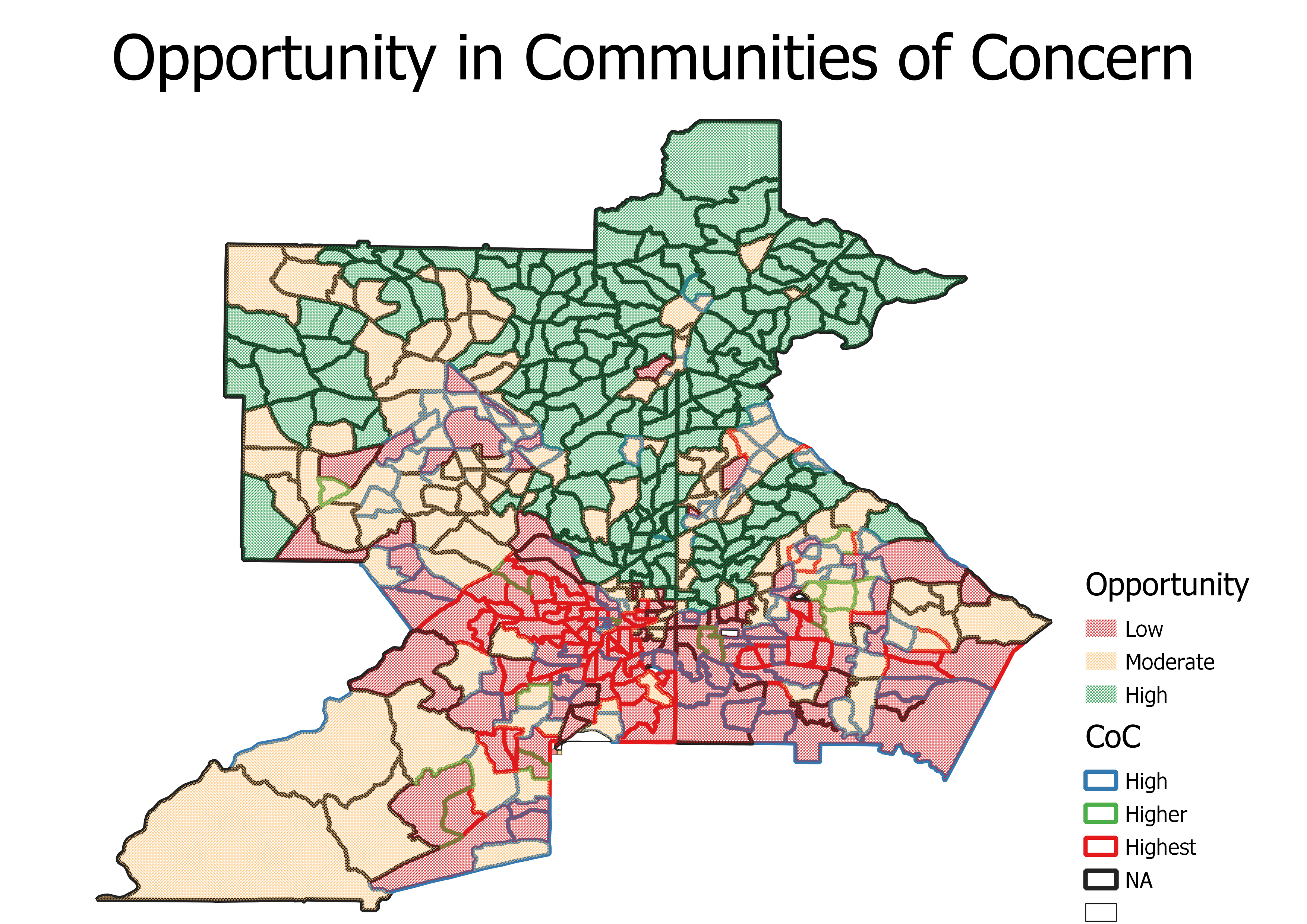
As you can see, the map for opportunity is very similar to eviction. The relative affluence of southern Dekalb county compared to Fulton county, with most tracts in the county only at the high designation and not the highest level of concern does not shield it from the general deprivation of opportunity south of the line I encountered when I crossed the color line into Edgewood. It is notable that all the outliers on opportunity, that is to say, communities of concern that provide levels of opportunity that exceed 14 percent for the high threshold are all north of this imaginary line.
Bringing everything together, we can see that the vast majority of high opportunity observations are not located in communities of concern with a few notable exceptions highlighted by the labels indicating census tract. Those census tracts correspond to Merry Hills, GA near North Druid Hills, Buckhead, and Roswell. Again, all north of the line.

Eviction is also unusual in communities without concern, and the few high count observations usually reflect that observed evictions are a fraction of very small number renter-occupied units as most residents of the tract own their home. As reflected in the averages across communities for concern (yellow dots=high, red dots=higher+highest), eviction rates above 10 percent are extremely common. Just like black southerners in other cities throughout the south, black residents of South Atlanta bear the brunt of this nation’s eviction epidemic. However, I don’t believe it is a coincidence that the three CoC’s which would make for fine candidates for a Chetty mobility experiment should he turn his attention to Atlanta all have eviction rates that hover in the moderate range of five percent. An immediate and permanent end to all evictions is not a useful goal. But if the American Dream is to be preserved, it should be made safe, legal, and rare. Protection, preservation, AND production is a slogan that resonates.
Applebaum’s characterization of that idea as a threefold commitment to equality, rights, and opportunity is one of my north stars.
Extracting eviction rate data from court data is notoriously difficult due to record-keeping procedures that vary by county. They lead to the opposite problems of null values and inflated counts. Princeton’s Eviction Lab validated up to the census tract level in April 2021 for a range of counties across the U.S., available to download for free on their website.
A large census geography used to indicate Greater metro areas that reflect commuting patterns picked up in mobility data.