Historical "Garbage Time" in Trump II
Luce's Retreat of Western Liberalism's Invitation for a Data Analysis Exercise

[Our goal ought to be] “to show [our contemporaries], in ever new constellations, that the social whole might no longer be visible, that it might be denied, that it might not even be conceivable, but that it can still be the subject of thought,” The New Yorker’s tribute to Walter Benjamin and Theodor Adorno in a review essay.
“Everything is computer,” Trump admiring the inside of a Tesla on the White House lawn brought to him by the broligarch-in-chief.
“Liberalism cannot survive the inside of an Amazon warehouse,” @NewleftEviews common refrain on Twitter.
I hope this post does not scare away too many new followers. I have two tendencies which readers of this humble blog know, and I think have learned by now are unlikely to change anytime soon. Strangely, the tendencies are opposite. The first is to dump an incredibly large amount of detail, usually tethered to datasets, retracing observations I have uncovered. The second is to suspend the investigation(s) uncovered and conclude on what might charitably be called philosophy but recognize for subset of you who this registers as a first impression will view as wild speculation.
The subtext of this post is apparent to anybody who has visited their social media feeds or opened their favorite daily paper, what Elizabeth Warren is currently calling the “stupidest financial crisis” ever conjured. Or, Tooze’s ominous warning at the New School that the epiphenomena of Blinken and Trump casually jamming to “Rockin' in the Free World” suggests we have entered into what the Chinese call the "garbage time of history”. The impression from Tooze’s lecture, which he left in an unrefined state intended to provoke rather than propose any scheme which draws up undeserved coherence, is still undigested. But the crumb I am hanging onto is tying garbage time to the great anthropogenic crises of transformation of our time, chiefly climate breakdown and global pandemics “one way traffic into the unknown”. Harkening back to Polanyi, the great transformations not only unleash fury in Nature but distort the mental substance of Man so thoroughly as to render him unrecognizable. Units of subjectively experienced time have accelerated to such an extent that rational thought is no longer in command, instead we have only reflexive reaction escalating to failure. In Goethean fashion, if we no longer see how can we learn, two social theorists conclude in a little book:
“Is not the failure of the smartphone [and its attendant ad tech] simply the failure of the iron hammer as the wooden handle breaks? The answer is “no” as habitual failure in the age of digital and financial markets do not teach us something new about the world;… their repeated breakdowns do nothing more than further obstruct the underlying logic and the hidden infrastructures which sustain them”
Another perspective Tooze’s historical sense is likely sympathetic to reverses the salience of garbage time. The Argentine essayist Borges once opined just how unusual rational communication is in the Library of possible forms, the default of all language is nonsense, utterly useless nonsense arising from random combination. The historical significance of the Liberation Day pronouncement is that we have reentered a truly vast historical terrain, garbage time, conditioned by little else other than the arbitrary exercise of power.

Regardless, a question emerges: could it have been otherwise? Could the Trump-Blinken horror show have been held at bay? I have always held a soft spot for alternative histories. A Twitter mutual recently prompted one such exercise, presumably implying that a hypothetical Gore administration would have responded enormously differently to the 9/11 attacks, reverberating all the way down to present.

My instant reaction is under that timeline, Earth II, there is no Great Financial Crisis, because as Alex Bronzini-Vender has pointed out the “dark logic” of Democratic politics is electorate would favor Democrats as adults in the room. McCain was roundly embarrassed by Obama in the Paulson briefings. Moreover, it seems to imply that the fury of Republican politics is delayed because I suspect a resurgent Tea Party would have made McCain a one-term president. Does the Booker administration undergird the U.S. agency patchwork with South Korean efficiency to the COVID-19 pandemic armed with the McKinsey-bred Buttigieg to bean count every resource bottleneck and evidence of infectious spread?
I encourage the reader to play out more scenarios in their head, but we will have to drop them or we won’t be able to proceed in an organized way except to note the obvious under this sequence there is no Trump. What is the butterfly effect which could have stopped that historical force from unleashing, reentering garbage time? Is Al Gore such a Great Man of History that he himself would have stopped it? Did he have the omniscience to notice what Steve Carrell’s character saw of subprime in The Big Short? Or are there much bigger structural factors which are at play which engendered the rise of this demagogue, largely due to the integration of certain technologies which enabled certain undeliberated decisions. We already visited the theory-laded perspective, Arjun Appadurai on “failure” cited above. The narrative account is more gripping, described best by Ed Luce in a 2017 book, The Retreat of Western Liberalism, comparing two hubs of Anglo-American capitalism:
Today, Chicago, like London ,sucks in the best talent from its interior in the Midwest…In the past, Chicago acted as a regional locomotive, buying the Midwest’s farm produce and other raw commodities and then converting them into products. The city was linked to its surrounding geography and vice versa. Now it mostly hovers above its hinterlands. In some ways it is also parasitic on them….much like the giant sucking sound of London hoovering up the UK’s talent, Chicago now takes the best ….& plugs them into the global economy. Chicago’s success is no longer symbiotic with its rural neighbors. It comes at their expense…in 2011, London’s mayor saw the downside when the capital’s fringes went on the rampage for several days…looting what they could not have. Five years alter, Britain’s left-behinds vetoed London’s economic interests in the Brexit referendum. To the West’s economic losers, cities like London and Chicago are not so much magnets as death stars.
Intoxicating, and indeed the paragraph I latched onto when I read in 2017 following the shock of the November election, but is it true? What basis do we have to assess truth? Let’s proceed.
The Greatest Transformations are Statistically Imperceptible
Even though I will grant the criticism that this capitalocentric regional concentration view might be off base to understand the rise of Trump, let’s take Luce’s narrative description as a given for purpose of discipline. The statistic that is frequently cited in these conversations regarding the alignment of the GOP away from economic activity is the 2016 Brookings study. In 2000, Gore won 659 counties totaling an aggregate share of 54 percent of 2000 GDP. 16 years later, Clinton won fewer counties, only 472, which commanded a much higher aggregate share of 2016 GDP, 64 percent. It’s a move which is pretty jarring, but by itself says little about the what, where, and why economic activity changed since 2000.
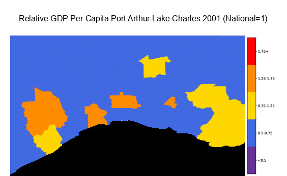
Burning curiosity drove me to climb into the BEA API endpoint to generate some county-level maps of relative GDP per capita in 2001 and 2022. Relative GDP per capital is simply the GDP per capita in a given county divided by the national GDP per capita at that point in time. Most counties fall under 0.75 but above 0.5, very distressed counties fall below 0.5. Most cities are around the national level, but the successful ones are 25 percent higher, and the superstar metros are over 75 percent higher. Counties are divided into three regional buckets, urban, suburban, and rural. Urban are 50 most populously cities. Suburban any core-based statistical area exclusive of top 50 metros, and rural is the remainder in any given state, tallied as a single relative GDP value by state.
By that scheme, this is the output for two county-level maps. In 2001:
We will look at this map in more granular detail, but suffice it to say now there are very few superstar metros (red regions >1.75), and even San Francisco, Boston, and Washington DC are not hyperstars (>3x). Atlanta, Charlotte, Minneapolis, and Denver concludes the list. Not a single state remainder, all counties in a state excluding the list of a state’s core-based statistical areas, falls in the purple distressed level, below 0.5. The few distressed counties, like Glade county in central Florida, are noteworthy but have to detect with a microscope.
It might not immediately register to the eye at the national level but we observe a darkening of successful metros and entire rural areas getting thrown into the distressed category by 2022:

Significantly, the 2010’s shale revolution is also visible on this map, with rural portions darkening 1 shade for Texas and jumping two shades in the case of North Dakota. Chicago is misidentified in Luce’s narrative account of “hoovering”. It comes as a surprise to nobody that Seattle and San Francisco are the big winners on the urban side of the equation. Nashville emerges as one of three superstar cities of the Southeast.
So change is the way of the universe, industries are born and die every day and people move and work to create new human capital to fit those opportunities. This is the dynamism of the American labor market. Yes, if the changes on the map were merely a question of shifting. They are something a little more worrisome, as some made-up county-level lorenz curves underscore.
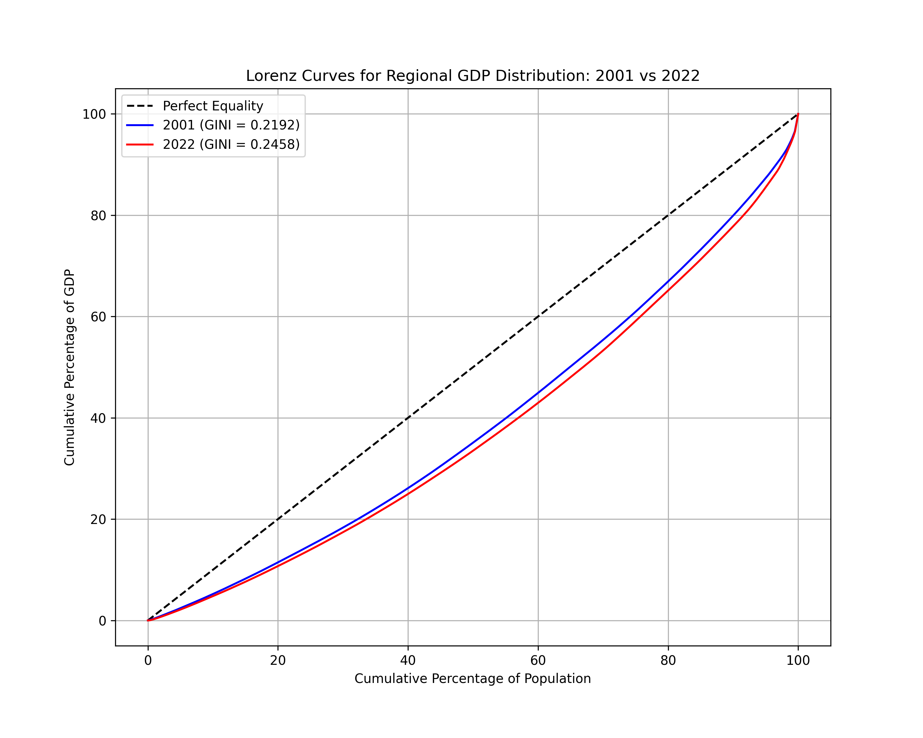
Just as is true for the more conventional income and wealth reporting, the 90 degree straight line represents perfect equality a GINI of 0, the greater the area between the curve and the line of perfect equality, the greater the regional GINI index. It’s unfortunate that shift from the blue to the red line is so imperceptible, because I suspect that the thunder of 21st century American history takes place within it. To illustrate what is meant by me repeating Schumpeter, we are going to have to zoom into a few specific areas. Discussion of each over the period analyzed should merit their own dissertations but this is a blog so we will settle for listing them out.
No Perspective is Solid—Calling out 5 Regions
My thinking “comes out of the French schools…a skepticism of ontological solids, about the givenness of the macro world which we can start with, but [must from there] scope from the particulars to the macroscopic and back again,” Adam Tooze.
We will start with Houston-Port Arthur-Lake Charles in corridor in Eastern Texas and Louisiana, simply because it is one of the few regions on the national map where every county changed color. These are all remarkable declines, and does not even exclude successful metro, Houston, the large orange area on left side of the chart. Significantly, there were four very prosperous regions in 2001, marked as orange which had all declined precipitously by the end of the period. Hurricane Katrina very likely played a part in the extreme transformation of the region, but I suspect not exclusively. It might not be a coincidence that Arlie Hochschild, the esteemed sociologist selected Louisiana to conduct her ethnographic study of the Tea Party. She quotes a chemicals expert and resident who notes wryly that contrary to hopes many foist on extractive industries, that the result is often substantial leakages to wherever corporations and shareholders are domiciled, in Mill Valley, Greenwich and elsewhere. Open veins in North America. We will see Texas-Lousiana Rust Belt in spite of a statewide boom is more substantial than the Rust Belt of formerly great auto manufacturers, the weight on the American imagination of latter notwithstanding.
Unlike either of the other two near-threshold states, Florida and Alabama, where rural share became distressed, a very substantial decline ~24 points was required for Louisiana to fall into the purple tier. Hochschild’s study deserves to be revisited because it captures what can happen to a region even in the wealthiest country in the history of the world when the polycrisis nexus visits in quick succession. In essence, Hurricane Katrina then doubling the natural catastrophe with the idiocy of austerity, namely the Tea Party favorite, Governor Bobby Jindal, who is now a relic of the 2010’s. An important consequence of that policy course is it solidified Louisiana’s 49th position in educational outcome rankings, Hochschild emphasizes. That is disastrous in our world where access to deep networks of human capital is the single most important factor for a orange or red color. Activist government policy favored by Jindal and other red state governors which promotes tax incentives to large corporations to locate operations is a poor alternative that does not overcome this constraint.

Other regions in the South are just as fascinating. Similar to Louisiana, Alabama moved down a shade across the state, including two major cities Tuscaloosa and Montgomery. I have the red area of Georgia circled with all these semi-prosperous yellow counties disappearing from the 2022 map because it was something I noted with my eyes in my 2018 trek through rural Georgia. For this California boy, it is not an altogether different experience from exploring the struggling Southern corners of the Central Valley. In both locations, there are often visible architectural signs on the street scenes of former grandeur which is absent as the elites have flocked to the most successful areas. It’s as difficult to imagine a President coming from Plains, GA as Grayson, CA. But two differences. The loss of grandeur felt more recent from eye level in Georgia. And there is clearly a “from the other side of the railroad tracks” racial divide in Georgia towns, which is not absent from agricultural counties in California, but less overt at eye level. Note greater Atlanta (red yellow region) looks identical as reported by the map but masks a decline in the exurban portions which is almost as steep as elsewhere in the state.


Virginia is fascinating because it is the least expected to be a regional relative decline given the expression all roads lead to Rome. The DMV area surrounding Washington DC does not fall very substantially, only 31 percent above national to 20 percent above national. But the fact that is often repeated that all the nation’s richest counties surround the nation’s capitol seems to be out-of-date in a world where Silicon Valley exists. Rather, the potential for rent-seeking notwithstanding, it is no different from other metros like Atlanta, more and more of the marginal economic activity takes place where human capital resides in the red dots. Roanoke and Richmond, both very prosperous in 2001, fell much more sharply than the surrounding DC area ~0.25 points. Allentown, PA in the top right purple circle is with Port Arthur as among the steepest declines in the entire dataset.


North Carolina is heralded for its tri-cities region, but over a dozen counties change color a tier, including all the counties surrounding one of the dozen superstar cities, Charlotte, exerting its gravity to collapse at a single point.


The Rust Belt is strangely the least interesting and most mixed. Predicably, Oakland County and Ann Arbor, MI were moved down a peg (orange in red circle). Gary, Indiana is well-known as a horror story of American industry, and it predicably disappears in the green circle, though it is interesting I would have guessed it to disappear long before. The dozen counties surrounding Indianapolis appear to be thriving. If you want to cherry-pick stories of successful regional integration so as to suggest an American revival occurring under our feet, as Fallows writes in Our Towns, Indianapolis might be a place where you choose to look.
From Time to Start Thinking to The Retreat of Western Liberalism
While useful as a tool for taking a glance at broad regions, color codes thresholds don’t pick up on everything. Here’s a full list of a cities on the declining end which are interesting to include:

The top of the list is interesting because all are represented by the Freedom-QAnon Caucus-Tea Party amalgam under the GOP circus tent. I suspect you would have to go as far as Rochester, NY to find a Democrat, and I am not certain that is even true given the New Jersey-New York swings in last year’s election. Allentown recently switched parties in a tight November race, but a guy who is throwing racist bullhorns regarding the current measles outbreak won. This former car dealer is the rep for Lake Charles, equally willing to join in on racist drivel regarding Haitian migrants. The rep for Northwestern Georgia needs no introduction; it is none other than the top member of the QAnon caucus, Marjorie Taylor Greene. Beaumont-Port Arthur has an equally famous former member of Congress, Ron Paul. Greensboro is represented by this lady and the huge region of Northern Nevada which includes Reno is represented by this guy. To be sure, the correlation might be omitted variable bias in the sense educational attainment is third variable, intervening both in propensity for reactionary voting and maladjustment of labor markets to changing economic structure.
Cities might not display the political repercussions, but they are no less significant to note. The general trend in cities is a rollback in the suburban parts (Geography column), even within dynamic cores (City column) which are more or less perpetual motion machines:
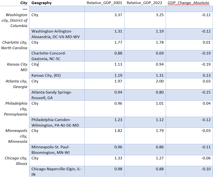
Consistent with Luce’s account in The Retreat of Western Liberalism on the suburban precariat, in all these examples the suburban portions have a remarkably different trajectory than their urban core. In all except Philadelphia, this means increased divergence between the dense economic activity in concentrated center from outlying suburbs. Atlanta is the interesting case to note for me personally. I recall a conversation with a native Georgian somewhere in the Inman Park neighborhood of Atlanta when I had first arrived. I inquired if what I see in front of me is Georgia why doesn’t it vote for Democrats (Warnock/Ossoff wave had yet to happen). He retorted have you been outside the red dot perpetual motion machine yet— even 10 miles outside the center? You will see very quickly, he instructed this naive questioner (who was not entirely off base Warnock/Ossoff did happen).
The unambiguous winners from the national list will surprise not a single soul who has opened Bloomberg in last two decades, but the numbers are still worth listing off if only to get a sense of where the flows ended up.

Regional Inequality is not Inevitable: Stubborn Optimism about China’s Economy
I hope the reams of statistics I have presented did not confuse when they were intended to clarify. Recall the original Lorenz curve chart I shared—such a small movement of the curve for such a dramatic change. But it may be argued that the U.S. is not exceptional in this regard. Every country in the world has demonstrated a similar shift, as winner-take-all network effects of SF-Seattle-Nashville-Austin-Boston-NYC are not unique to that set of locales.
So naturally, I became a little curious. I just uncovered a fact about regional distribution of economic output which if not wholly discounted (the China shock paper raised a storm with Case and Denton around 2016), is rarely mentioned at the forefront of the business press with the topline growth and unemployment numbers. What do my made-up statistics look like for China? So I begin exporting chart by chart the prefecture level data from the CEIC website.
Without even thinking, I began presenting the statistics in an analogous relative scheme. On closer inspection of the individual charts, I realized this was silly. The only way to tell the story of China’s transformation over the last 20 years is by reporting the absolute statistics. The poorest prefectures at the end of the period were richer than than the richest provinces at the beginning of the period. The dark red regions of coastal are the visual depiction of what the esteemed historian Andrew Walder meant when he lectured my Beijing cohort that China had already escaped the middle-income trap.


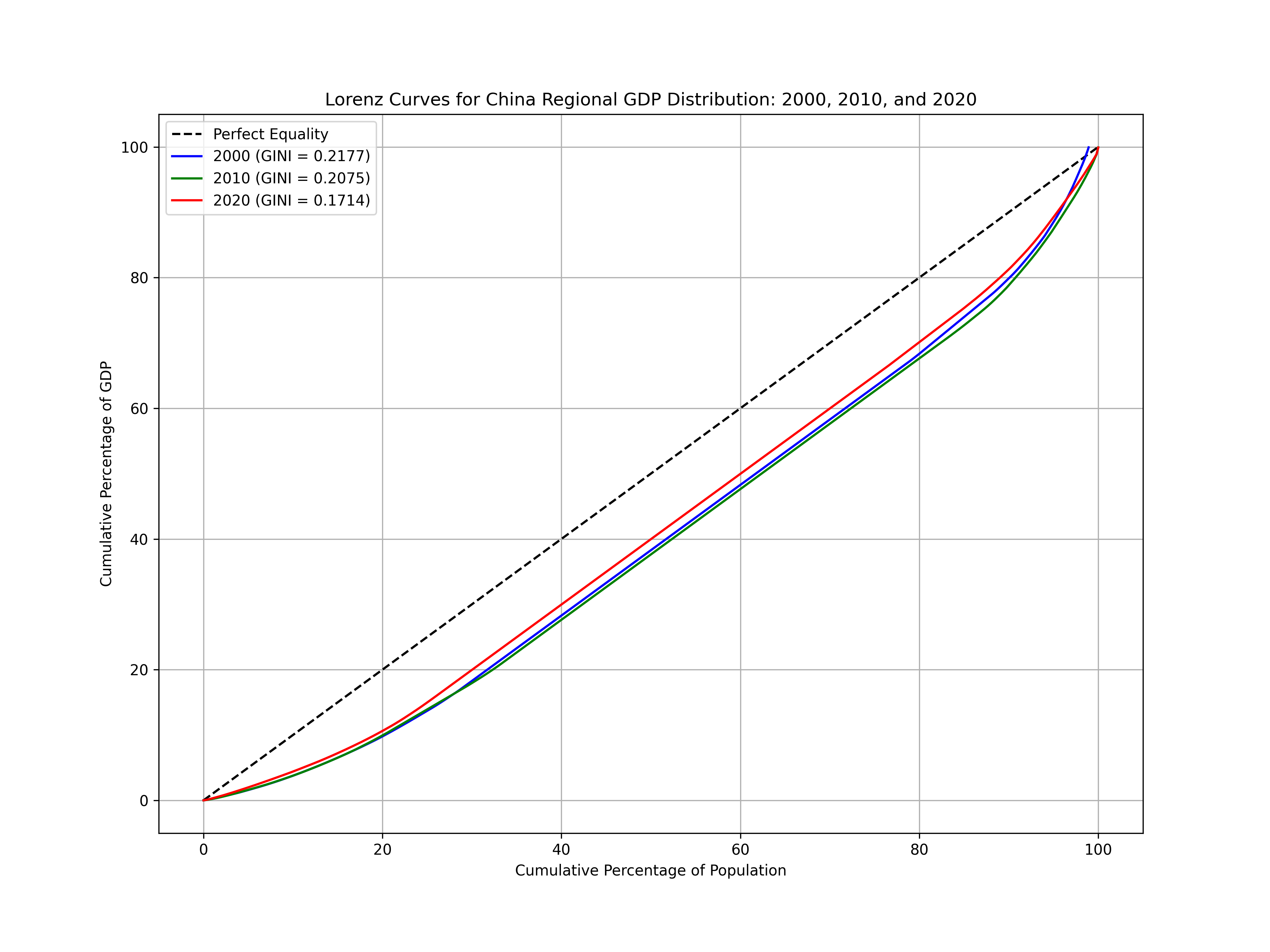
This depiction might be the only illustration that does any justice to the hockey stick which China began to ascend at the end of the period, but we still want a direction of travel to answer our basic question: is increasing regional inequality simply a feature of economic life in the new millennium? No, if you believe the statistics:
It’s true that I did not quite make an apples to apples comparison between the U.S. and China. Prefecture-level cities, while they are usually buckets of about 4 million people are much larger in the case of provincial cities like Shanghai and Beijing. I did not split either of those cities to create a Pudong or Xidan point in a similar manner that I created a San Francisco point within the larger metropolitan area. If I did this, I would increase regional GINI measures slightly in the Chinese sample. Though, it’s still significant that the gaping chasm that is often assumed to exist between the two countries may not be as large as it seems. My urban economics professor at Peking University (who would self-deprecatingly call himself a “land beetle” because he never obtained an advanced degree in the U.S.) often observed the difference between the richest and poorest state in the US is only 2x per capita. In China, it is around 10x. Professor may have boosted the discrepancy as reported by official statistics, but for good reason the urban-rural divide is fundamentally different in China than anywhere else in the world.
Whether China and the U.S. were at identical positions of regional inequality from their respective origins, then diverged in precisely opposite, almost symmetrical, directions can be disputed. But I think it’s reasonable to suggest that China under Xi has succeeded in reducing the vast gaps between the regions on the Eastern side of the Hu line where the vast majority of the Han population lives. Given the exogenous factors of the period, the shift from the purple to red line is an extraordinary achievement, on par with its abolition of absolute poverty, which does not get properly recognized by liberal mouthpieces. To the extent that those authors are Anglo-American voices, they may be wary to draw attention to their governing elites dismal failure to acclimate productive energies as broadly as possible. Accusatory diagnoses may be not so veiled admissions of that which ought to be addressed in the provinces of their own countries.
How to Stop the Tariff Man
I am a true believer that if the US regional structure of production was closer to the Chinese reported value of 0.17 that much of the nonsense that prevails in American politics would disappear. This is a claim which is made on the absence of evidence that ignores the scholarship of friends in history departments on the racial capitalism which still prevails in the American Republic. In any case, now that the nonsense has been released, it may be impossible to return to a restore point.
And yet this little post is less of an instruction manual on how to stop the little men with little ideas than a call to action. Namely, to 1) present the economy in ways that more accurately reflect how it is experienced by real people in real places 2) how these regional distributions reflect choices regarding the structure of production. A regional GINI of 0.25 and drifting up is a reflection of elite structure around tech-finance, which as Appadurai asserts bizarrely doubles down on the systemic deviance of the debt instruments which brought it there. A regional GINI 0.17, possibly 0.2, but drifting down reflects a different set of decisions to put engineering elites in charge. The ones I encountered on buses along my travels may not be particularly refined—you might even hesitate to call them “elites”. But they are produced in such vast numbers such that regions are flooded with useful knowledge producing a flying geese pattern westward that the regime hopes will bear real fruit by its centennial, turning the entire Eastern half from Henan to Shanghai top-coded red. Simon Kuper’s FT column emphasized the sharpness of the engineering youth and financial aged distinction on both sides of the Pacific this week. The question Trump’s baffoonery has similarly forced upon me and we should have asked sooner is Hayek’s revived for the 21st century: who is positioned to command?
The answer to my rhetorical question offers no solace, and wish reality were different. As Luce wrote in another neglected title, Time to Start Thinking…..